

The Japantown Project
Graphic Design 2, Northeastern University
Social Cause Campaign Semester Project
for Prof. Margarita Barrios Ponce
-
As of 2021, there are only 3 Japantowns left.
These cultural epicenters are currently at risk of extinction. Local small businesses are struggling to pay rent, have difficulty passing on family traditions and businesses, historical shopfronts are being replaced by non-Japanese businesses, and are experiencing decreasing visitation.
-
Revitalize Japantowns by highlighting and capitalizing on modern trends rooted in traditional Japanese culture in order to increase visitation and patronage in these areas. It is both awareness-based and action-driven through promotion and development of brand recognition.
-
One cohesive brand for Japantown that parents unique identities for each location
2D Poster Series that juxtaposes trends with tradition
3D Origami Maps which serve visitors with functional purpose and memoribilia
Website prototype as an all-encompassing hub of information for all Japantowns

Japantown. Anchoring these three communities under one name is a means to strengthen them each
under a single identity. These communities have been repeatedly reconfigured to fit the American reduction of Japanese culture. Now, these communities must continue to seize the prominence of Japanese culture in mainstream American culture. Not as a means of survival, but as a critical jumping point for reconnecting these trends to the traditions that root these invaluable communities in their name.


Color functions to highlight which Japantown is being referenced: San Jose uses KOI, Los Angeles uses SAKURA & San Francisco uses MATCHA as their primary highlight color.

Poster Campaign
This series employs language that connects Japanese traditions to mainstream trends in order to highlight the intersection of two in the physical space of Japantown. In these posters, the imagery is solidified within each location by color and shape.

Finding a way respect a rich history
+ making way for a new one to
be written.
Messaging
Japanese culture has long been historically revolutionized to appeal to western tastes. In these Japantowns, tradition and main- stream Asian American culture coexist to attract everyone: people who enjoy Japanese culture through trends, and those who who identify with their Japanese heritage.
In order to preserve these areas, the public is called to visit and patronize businesses, given adequate resources to explore and navigate these areas, and are subliminally reminded of their visit through subtle branding.

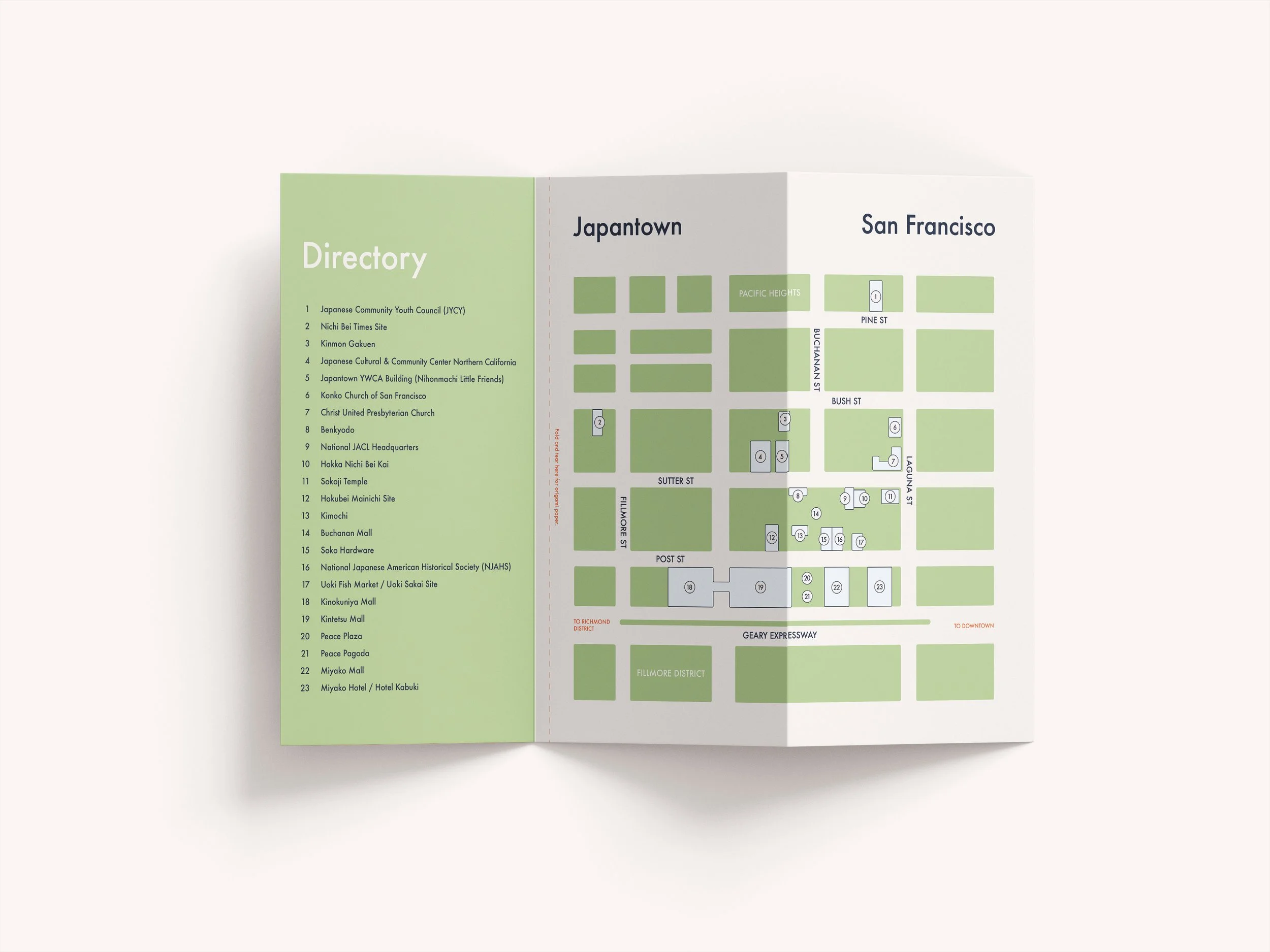
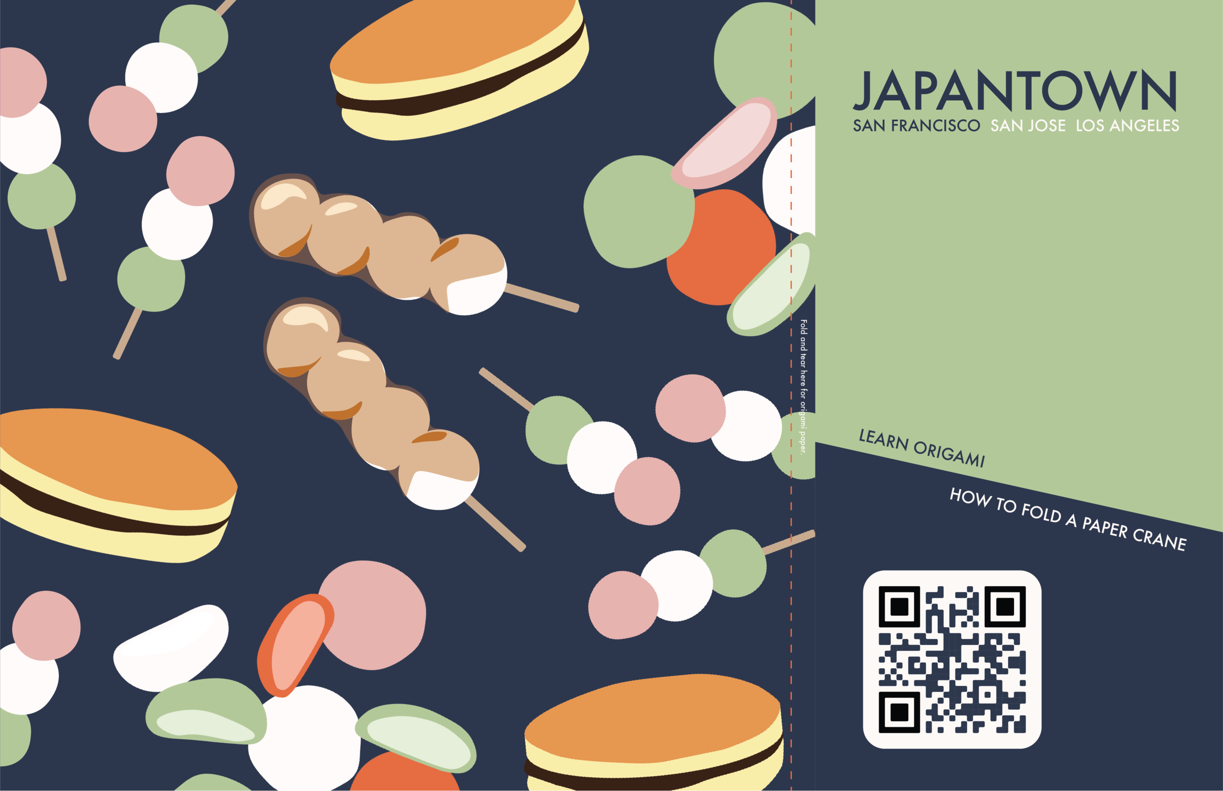
Origami Maps
This series uses trifold, brochure style maps; printed with a directory and map on one side and a square design on the opposite side. The front of the trifold contains a QR code that brings the visitor to a Youtube video on how to fold an origami crane. In this piece, the traditional art of origami is employed to transform a 2D informational piece into a 3D souvenir that visitors can take home after the map becomes obsolete.


Illustration
Inspired by the two-dimensional, geometric qualities of Japanese graphic design, and the vibrance of “Kawaii” pop culture, this campaign employs flat, vectorized illustrations of Japanese foods, cultural traditions, symbols, and objects. It offers the brand endless expansion of new imagery.